
This is where I’ll be talking about the Album Art that I like. That is one of the benefits of 12″ vinyl albums, the cool packaging that surrounded the record. Here I’ll research the creations that we all loved as children, teenagers, and adults. I’ll try to find as much information on the artists as I can.
I’m starting with one of my all-time favorite bands, “Chicago”. They have used an iconic band logo on most of their 37 albums. I won’t be able to touch on all of them but I’ll hit the highlights.

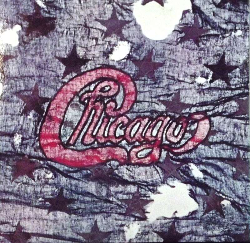
This logo would be the band’s icon starting with the second album “Chicago”. It was designed by the Art Director of Columbia/CBS Records, John Berg, with each album’s graphic artwork being done by Nick Fasciano. The cover of this second studio album is the logo layered over burnished stainless steel, the band’s official website labels the cover design, “silver bar.”
The Chicago logo…was fashioned for me by Nick Fasciano from my sketch.
John Berg
John Berg said the Coca-Cola logo was the inspiration for the Chicago logo. The third album, Chicago III was a groovy American flag design. “Chicago at Carnegie Hall” 4 record set came in a plain off-white box with the Chicago logo. “Chicago V” was reclaimed wood with the Chicago logo carved into the center.

Nicholas Fasciano grew up in Bayside, Queens, and studied design at Cooper Union. In 1965 he was awarded a Fulbright Scholarship to further study design in Frankfurt. For over fifty years as a freelance designer, Nick has designed everything from album covers to memorial sculptures.

He writes right, draws left, and he never stops creating. Nick and his wife Patricia live in Oyster Bay Cove, NY. “Chicago VI” was created from composites of bank note engravings. It also featured raised ink that lets you actually feel the cover. Chicago VII” is hand-tooled embossed leather, so you can feel the texture of the design.


“Chicago VIII” is a fabric embroidery textile featuring a red cardinal. The “Chicago IX: Greatest Hits ’69-’74” featured an incomplete billboard being painted by the band. John Hendrickson Berg (January 12, 1932 – October 11, 2015) was an American art director best known for his works at Columbia Records. Throughout his career, he won four Grammy Awards out of twenty-six nominations.


Berg was born in Brooklyn and grew up in the Flatbush neighborhood, where he attended Erasmus Hall High School. While in high school, Berg drew cartoons for the school newspaper. Upon graduation, he took classes at the Cooper Union. After earning his degree, he worked for Doyle Dane Bernbach and Esquire. Berg was hired by Columbia Records in 1961 and retired from the label with the title of vice president in 1985.

In two and a half decades with Columbia, Berg designed five Grammy Award-winning album covers: The Barbra Streisand Album in 1964, Bob Dylan’s Greatest Hits in 1968, Underground in 1969, Chicago X in 1977, and Love Notes in 1978. I always thought they should have teamed with Hershey’s and made these Chicago branded candy bars.

“Chicago XI” is credited as a regional map. The Marina City Tower, a building that is shaped like the logo, “Chicago XIII” is one of my favorites. The 1979 album is based on the tower in Chicago. “Chicago XIV” is a fingerprint while “Chicago 16” is the magnification of a computer silicon chip. “Chicago 17” is a brown paper package tied with string.


“Chicago 18” is a mosaic designed by Maria Sarno while the follow-up, “Chicago 19” is an aquarelle, a painting method in which the paints are made of pigments suspended in a water-based solution. Watercolor refers to both the medium and the resulting artwork.


“The Best of Chicago: 40th Anniversary Edition” (XXXI) is an envelope being closed with a red sealing wax Chicago stamp. “Chicago XXXII: Stone of Sisyphus” is an ancient boulder with the Chicago logo chiseled on it. The 2014, “Chicago XXXVI: Now” is a psychedelic checkerboard.


“Type and Image: The Language of Graphic Design” is a 1989 book by designer, educator, and author Philip B. Meggs who praises the Chicago logo. He describes it as “a warm vernacular form, executed in thick script letters with Victorian swashes in the tradition of sports teams and orange crate labels”. The book mentions the cultural and material background of the city of Chicago as inspiration for the logo; for example, describing the leather embossing of Chicago VII as representative of the great fire and the stockades.
The printed word can never aspire to document a truly musical experience, so if you must call them something, speak of the city where all save one were born; where all of them were schooled and bred, and where all of this incredible music went down barely noticed; call them CHICAGO.
James William Guercio – the bands original manager

Paul Nini of the American Institute of Graphic Arts describes the Chicago album series as a “real landmark in record cover design”. In 2013, the iconic status of Chicago’s album art was featured in a New York art museum exhibit, which centered upon ninety-five album covers completely selected from John Berg’s career portfolio of hundreds.