

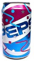
The “Pepsi Cool Cans” from 1990 refer to a promotional campaign by PepsiCo, the company behind the popular soft drink brand, Pepsi. The campaign involved a unique packaging design for Pepsi cans that aimed to capture the spirit of the 1990s youth culture and appeal to consumers in a novel way. The Cool Cans campaign utilized vibrant colors, distinctive patterns, and pop culture references to create a sense of excitement and trendiness.

The cans featured a variety of bright and eye-catching colors, often in bold combinations like blue, pink, green, and purple. These colors were intended to stand out on store shelves and attract consumers’ attention. The designs on the cans were characterized by abstract and geometric patterns, which added to the unique and contemporary aesthetic of the campaign. These patterns often covered the entire surface of the can, giving it a dynamic and visually engaging appearance. The Cool Cans incorporated elements of popular culture from the time, such as references to music, sports, and fashion trends.

The Atlanta Journal – Atlanta, Georgia • Thu, Apr 5, 1990 Page 48

These references were intended to resonate with the youth demographic and make the product feel relevant and connected to their interests. The Cool Cans were released as limited edition variants of the traditional Pepsi cans. This approach created a sense of scarcity and exclusivity, encouraging consumers to collect and showcase the different designs. The campaign was supported by various marketing efforts, including television and print advertisements. The ads featured young people enjoying Pepsi while showcasing the colorful and playful designs of the Cool Cans. The distinct designs of the Cool Cans encouraged people to collect and trade them, further driving interest in the campaign. Over the years, the Pepsi Cool Cans from 1990 have gained a certain level of nostalgia among those who remember the campaign. The designs evoke memories of the era’s pop culture and trends.
The cans were designed to be cool and fun and different; something to get the consumer’s attention, [the sex thing] nothing more than an odd coincidence.
Tod MacKenzie – Pepsi spokesman

The phrase “spelling sex with the neon cans” is a reference to a controversy that arose in 1990 regarding the Pepsi Cool Cans campaign. Some people claimed that if you arranged certain designs of the Cool Cans in a specific order, it spelled out the word “SEX” using the letters from the Pepsi logo and the abstract patterns on the cans. This claim led to discussions and debates about whether the design arrangement was intentional or coincidental. It’s important to note that PepsiCo denied any intentional attempt to spell out the word “SEX” through the arrangement of the cans.
The controversy likely emerged due to the abstract nature of the patterns and the tendency of the human mind to look for recognizable shapes and patterns, even when they might not be intended. The controversy surrounding the alleged hidden message added to the notoriety of the Pepsi Cool Cans campaign and generated additional media attention. While this controversy was part of the campaign’s history, it’s worth noting that PepsiCo maintained that the designs were not deliberately intended to spell out the word “SEX.”

The Palm Beach Post – West Palm Beach, Florida · Thursday, August 02, 1990
Further Reading


Sources
- “‘SEX’ in Pepsi Cool Cans” (Aug 15, 2002) https://www.snopes.com/fact-check/pepsis-got-a-lot-to-give/
- “Pepsi Cool Cans” (updated July 8, 2022) https://en.wikipedia.org/wiki/Pepsi_Cool_Cans
- “The Pepsi “SEX” Can, from 1990!” https://dinosaurdracula.com/blog/pepsi-sex-can-1990/
- “When Pepsi’s Cans Were Too Sexy For Shelves” (Jun 25, 2020) https://bettermarketing.pub/pepsi-sex-can-recall-a737e4f3ceed
- Newspapers